You can use this tool to explore the data from all years of the household survey.
Resources: Household Survey Home | Custom Chart Tool | FAQs
Instructions
To start, follow the prompts in the custom chart tool.
- First, select the type of chart you wish to generate. You may choose from five types of charts. For each chart type, a chart and data table are generated using the following default selections:
- Horizontal Bar: Unbanked for Nation, 2023 by Education
- Stacked Bar: Unbanked for Nation, 2023 by Age group
- Vertical Bar: Unbanked for Nation, 2023 by Family income
- Map: Unbanked for All States, 2023 (unbanked rates displayed)
- Pie Chart: Unbanked for Nation, 2023
- After selecting a chart type, you will be directed to a new page that displays the following:
- Customize Chart Variables or Add Filter box that displays the default variables and filters used in the chart you selected, followed by Chart display options (for selected chart types).
- Chart based on the selected chart type and default selections
- Table that contains data used to create the displayed chart
- You can customize the current chart by selecting different options in the Customize Chart Variables or Add Filter box. Click Update Chart when you are finished. The page will then refresh and display the updated chart and data table based on those selections.
- You may filter the data on up to two variables. For each filter selection, select a topic, variable, and the value(s) of the variable to filter on.
- For the vertical, horizontal, and stacked bar chart types, additional customization and chart display options are available.
- To change the variable being displayed on the Y-axis (the household behavior or subject of interest), use the Y Topic and Y Variable drop down boxes. You may also use the Y Value selection window to select the categorical value(s) displayed on the chart.
- To change the variable on the X-axis (the subpopulation(s) of interest), use the X Topic and X Variable drop down boxes. You may also use the X Value selection window to select the categorical value(s) displayed on the chart. To include the estimate for all households, click the All Households checkbox.
- Click Rotate Bars to adjust the chart layout from vertical bars to horizontal bars, or vice versa.
- For vertical and horizontal bar charts, click Regroup Bars and Legend to switch the bars displayed on the X-axis with the variable displayed in the legend.
- To save the chart as a PDF, PNG, JPG, or SVG, click the appropriate file type next to Download As above the chart. To save the table as a PDF or spreadsheet (CSV), click the appropriate file type next to Download As above the table.
- To select a new chart type, click the desired chart type next to Change Chart Type at the top of the page.
Example
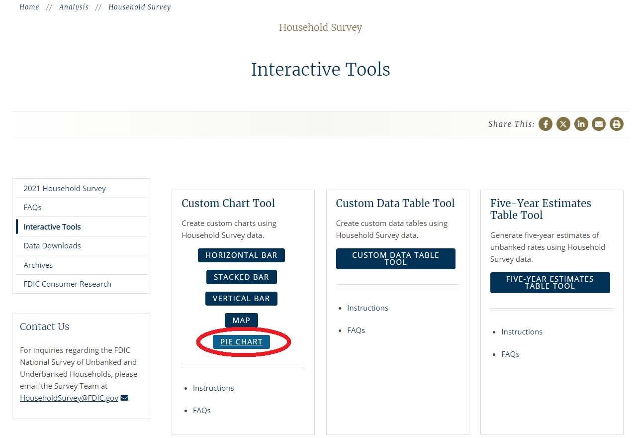
Suppose you would like to create a pie chart. Begin by clicking Pie Chart on the Interactive Tools page.
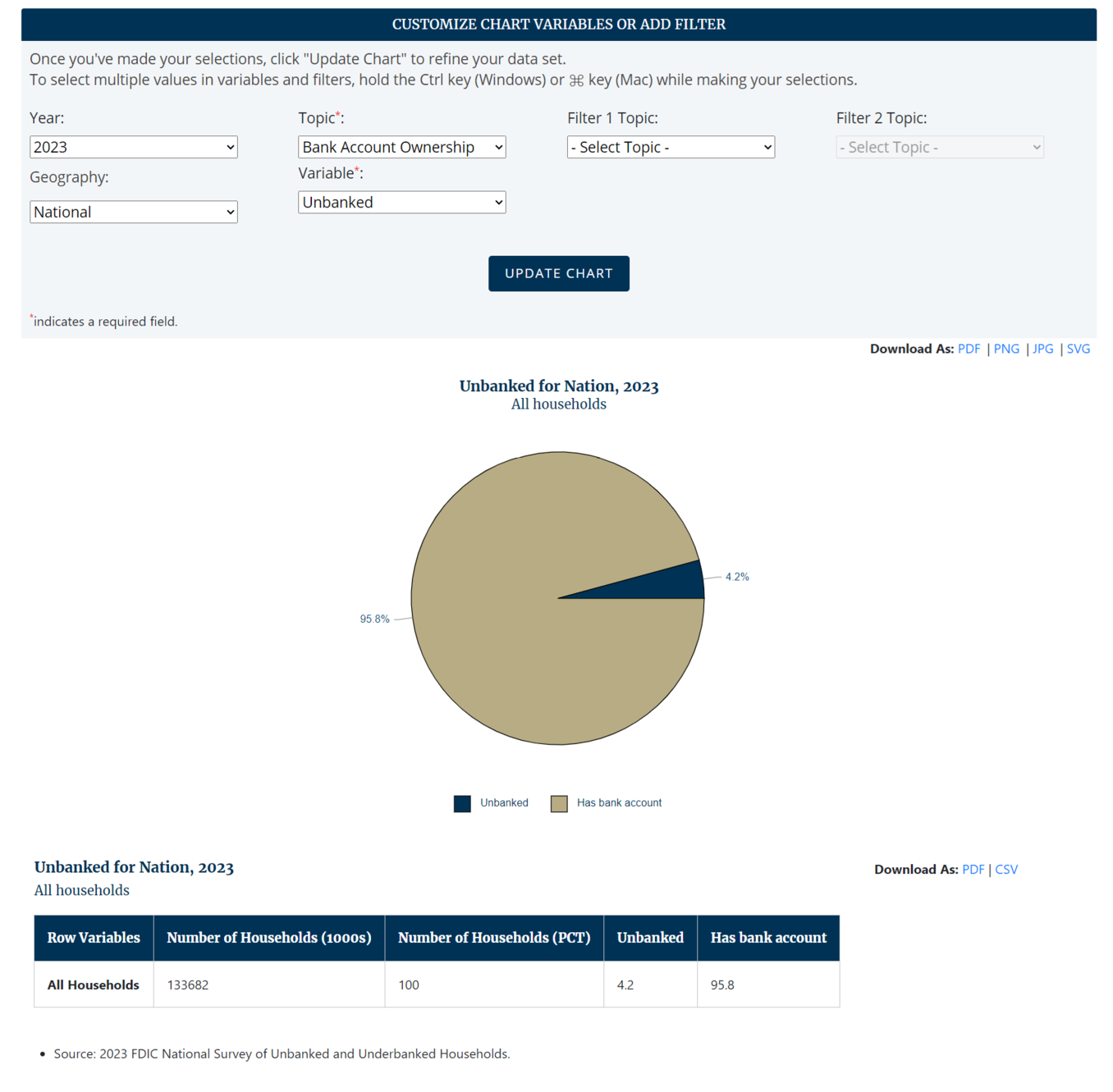
A new page will generate with the Customize Chart Variables or Add Filter box that displays the default values, the default pie chart, and the data table. For the default pie chart, Year = 2023, Geography = National, Topic = Bank Account Ownership, Variable = Unbanked, and no filter is applied.
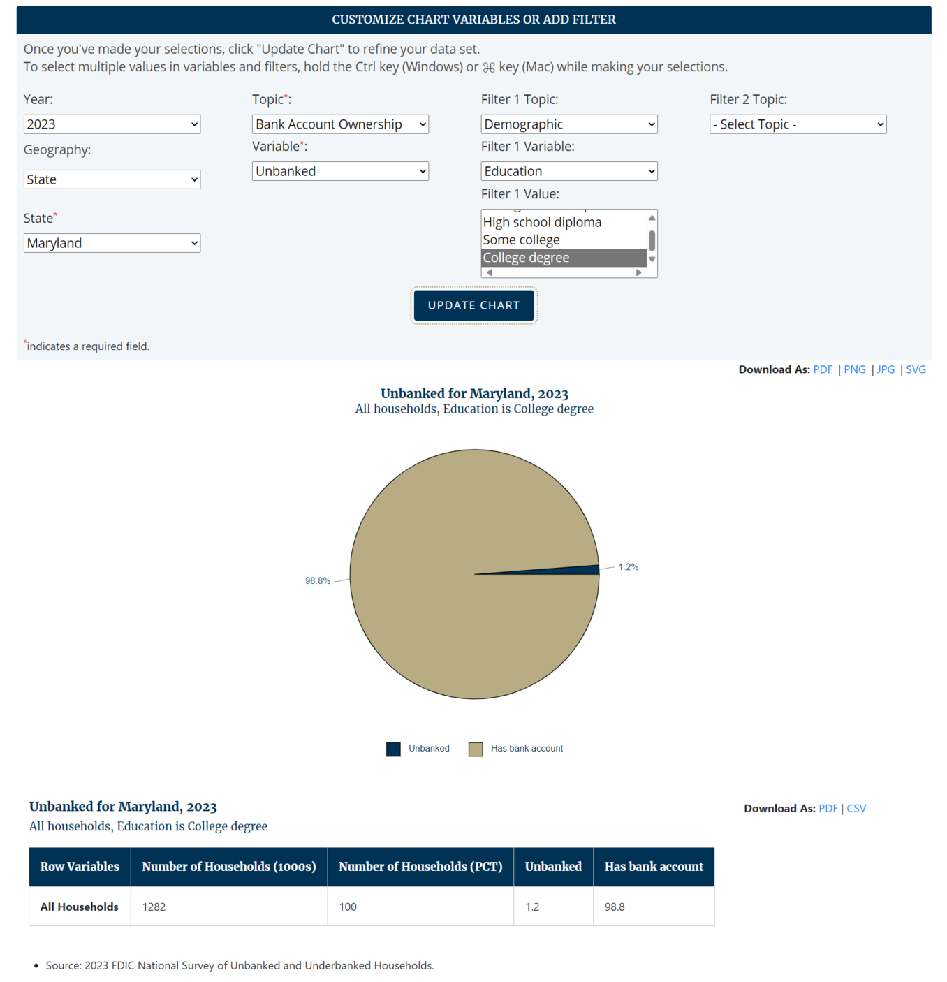
Now suppose you want to create a pie chart of prepaid card use for Maryland only in 2023, among households with a college degree. Make those selections and click Update Chart.
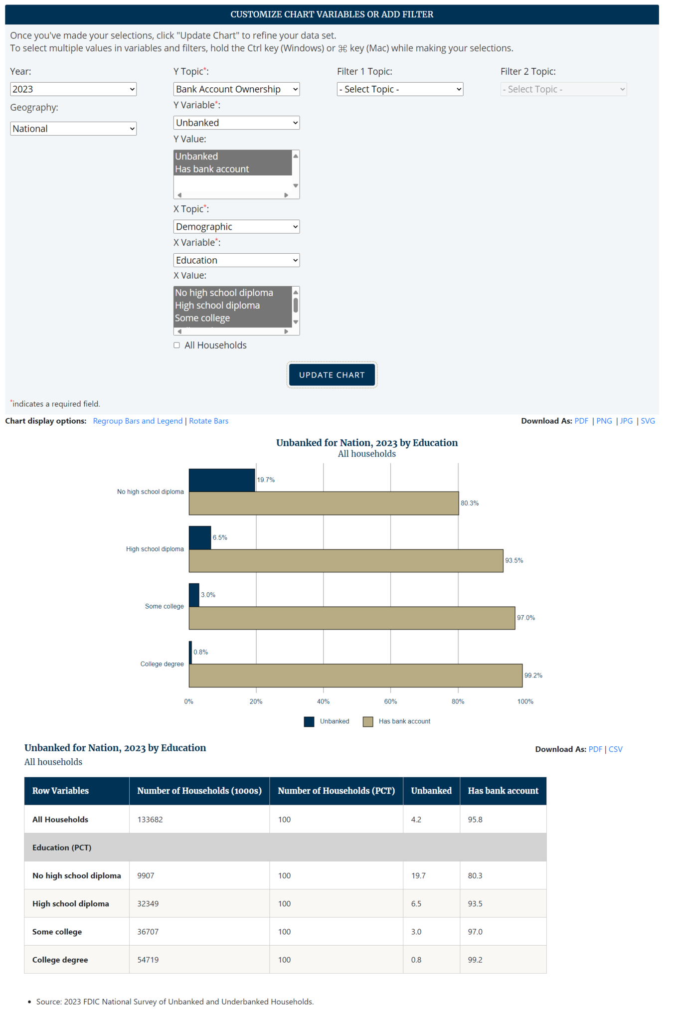
Now suppose you want to create a horizontal bar chart. Click Horizontal next to Change Chart Type at the top of the page to generate a new page with the Customize Chart Variables or Add Filter box that displays the default values, the default horizontal bar chart, and the data table. For the default horizontal bar chart, Year = 2023, Geography = National, Y Topic = Bank Account Ownership, Y Variable = Unbanked, X Topic = Demographic, X Variable = Education, and no filter is applied.
Now suppose you want to create a horizontal bar chart of unbanked rates in 2023 by geographic region. Make those selections and click Update Chart.
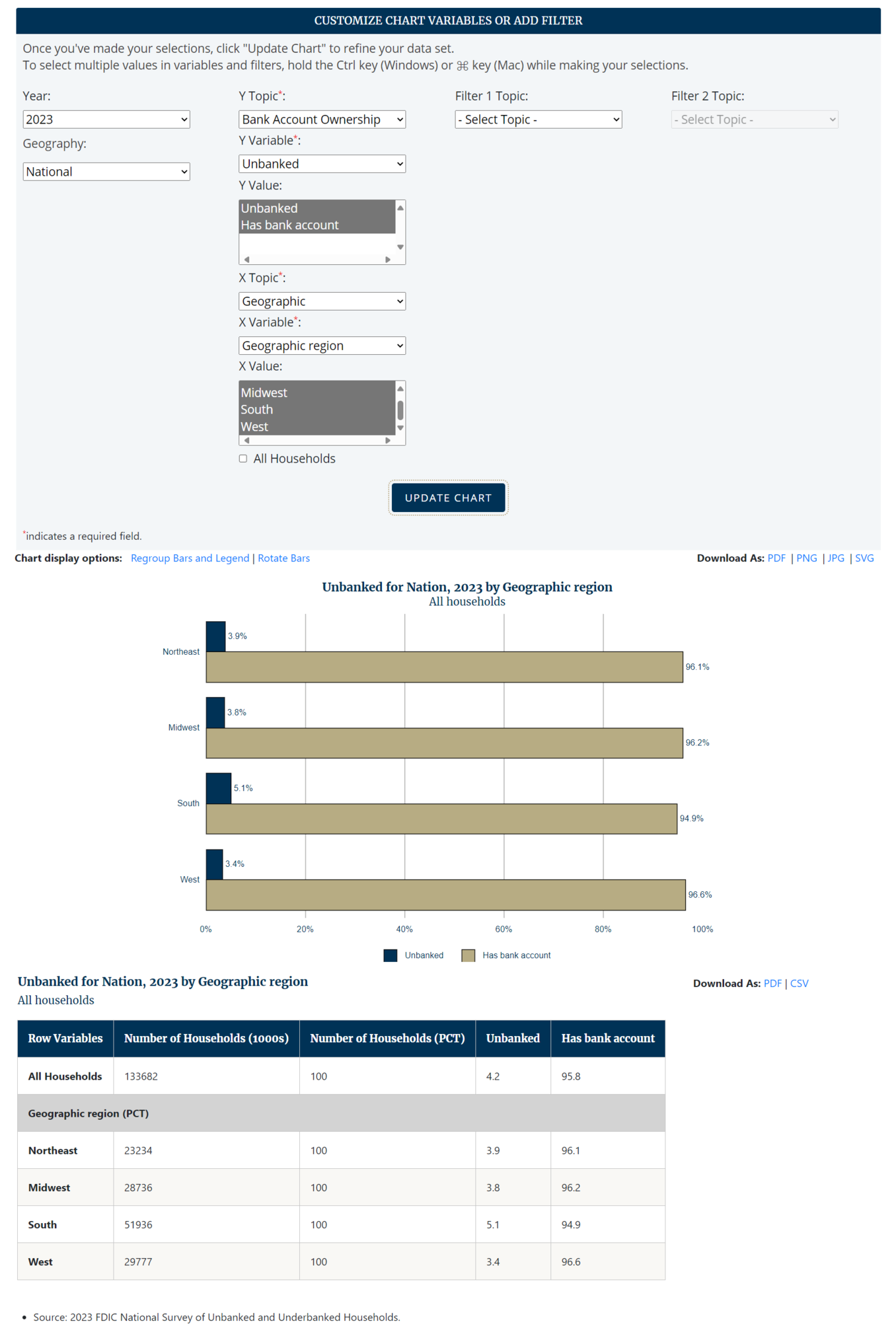
If you would like to see the same information as a vertical bar chart, click Rotate Bars.
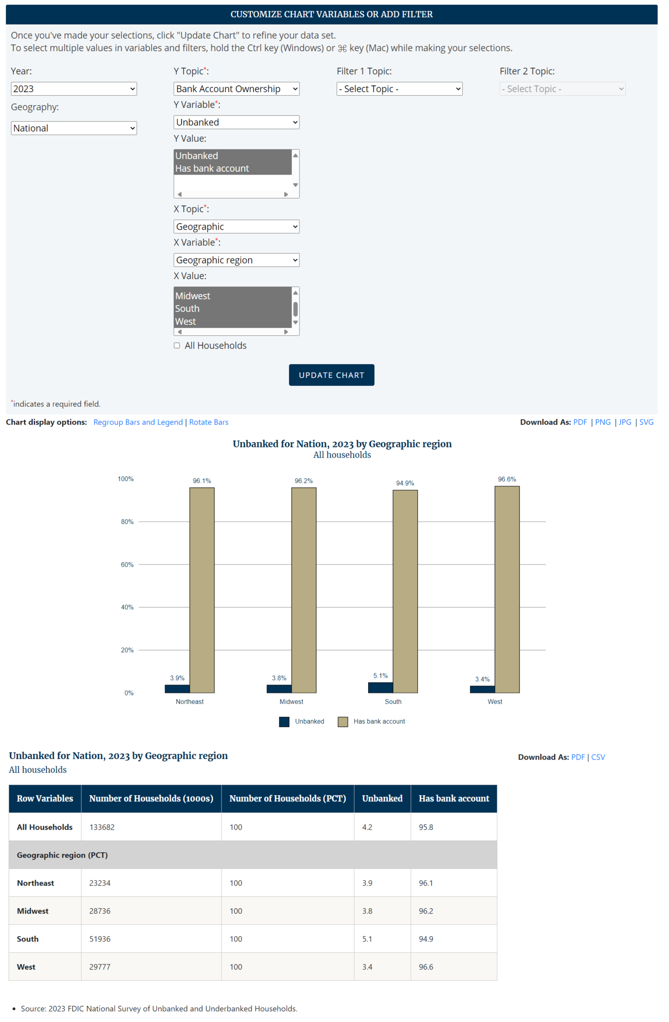
If you would like to regroup the bars, which switches the bars displayed on the X-axis with the variable displayed in the legend, click Regroup Bars and Legend. This feature is available only for vertical and horizontal bar charts.
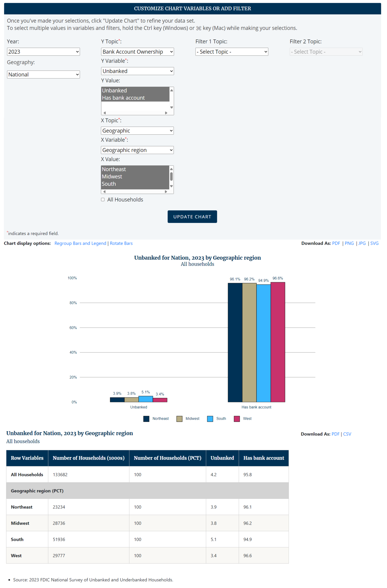
If you want to use the chart that you have created in a presentation or report, save the chart as a PDF, PNG, JPG, or SVG by clicking the appropriate file type next to Download As above the chart. You may also save the table as a PDF or spreadsheet (CSV) by clicking the appropriate file type next to Download As above the table.
For additional information, please see the Custom Chart Tool Frequently Asked Questions. You may also submit a question or a request for technical support.
